Tile Talk
Hello people! How’s everyone doing? I keep seeing this quote about how a year ago this was our last normal week and nobody knew it… and it blows my mind that it’s already been a year. It seems we’ve come a long way, but still are very much living in uncertain times. And while adapting to uncertainty is no small feat, I know whatever this year throws at us as a collective will be more manageable, and less shocking… you know since we’ve been shocked enough the last 365. HA!
And moving on to a topic relevant to interior design - action!
This week on the blog we’re highlighting some of our favorite and most asked about tiles throughout our projects over the years. From statement tiles to go-to neutrals and basics, we’ve got you covered. There are SO MANY options out there, so many different materials, and so many end-uses. Whether you’re a designer looking for some inspiration our sources, a design-lover, or a homeowner looking for a backsplash or shower tile - this post is for you. Read on and enjoy some of our all-time favorite tiles used to date.
JuneShine Ranch
Bar Front - Cle Tile’s Cement 'Point' in Kelly/ Leaf + Cement Solid Square 8”x 8” in White
This patterned tile sure was a statement, and we get both commercial and residential clients asking about this tile. We knew we wanted to play off the first location in having that color-pop and play on pattern on the bar where, let’s be real, most people are spending their time at JuneShine. The bar in this location was massive, so we layered in some solid white squares at ‘random’ to break up this large use of pattern- random being a mock-up we created for the installer with exact placement of these ‘randomly placed’ white tiles of course :) check out more shots of this bar tie and overall project here.
Cool Cats on the Block Residence
Kitchen Backsplash: North County Tile’s 'Asuka White Mosaic'
Oh baby is this a favorite! I could use this mosaic in just about every project - that’s how good this tile is. The warm and organic base with a speckle throughout creates this perfect use of a light and bright neutral while still spicing it up from a solid white tile we see so much. The fact that this tile can be easily laid into different projects is to me what makes for a timeless design - you just can’t go wrong. More shots of this stunner of a tile here.
Robbins Ranch Residence
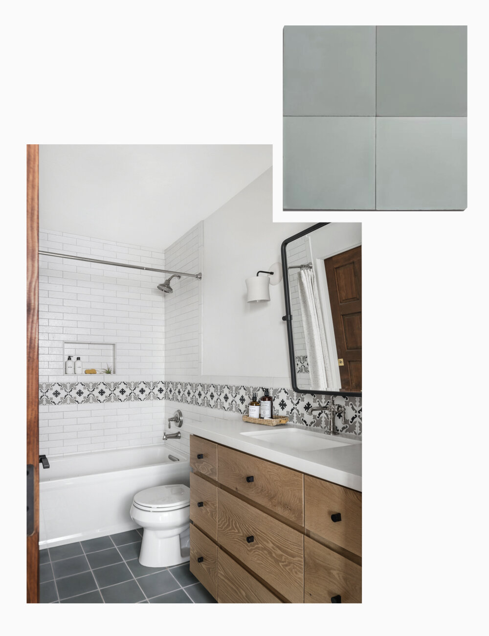
Kid’s Bath Floor -Cle Tile’s Solid Square 8" x 8" - Basil
Subtle, neutral, and soft - this concrete classic could be layered in to a lot of spaces and design styles as well! We knew we wanted to incorporate color in a really subtle way in this kids bath, and create a space that the kiddos could evolve in that wouldn’t feel outdated later on. Pair this ‘Basil’ color with some natural wood and textured white tiles and you will be in a timeless treat.
Robbins Ranch Residence
Master Bath Shower Walls - Zia Tile’s 2” x 6" Graphite Grey Zellige
Looking for a showstopper in your space? Look no further! While Zellige might not be for everyone as you must be okay with imperfections and inconsistencies, this tile adds so much character that just can’t be replicated. This master bath was light, bright, airy, and - surprise, surprise - a lot of neutrals, so again we wanted to bring in some color and life to this space. Thank heavens the clients were up for a bold pop of color because it led to this dreamy shower situation.
Cool Cats on the Block Residence
Powder Bath Accent Wall Tile - Bedrosians 5” x 5” Cloe White
This tile is fitting to go after the Zellige, because it definitely mimics a square format of that tile in a very subtle way! This tile gives you the variation in color that Zellige gives you, but in a slightly more consistent way - and is a much more affordable option. This tile is also available in a 2.5” x 8” size and has become one of our go-to’s for cost effective wall tiles.
Cali Cool & Collected Residence
Kitchen Backsplash & Master Bath Wainscot Tile - North County Tile’s 'Boston Arctic'
Last but not least, another spin on a classic white tile we love to swap out for your standard subway. The elongated shape, and natural texture to the tile adds character and spices things up in a really subtle way. This ones for you folks thinking a white 3” x 6” subway tile is the way to go - switch up, the slight change in size and glaze makes a space feel that much more special.
I hope you loved this tile roundup as much as I did!! It’s so fun to reflect back on these projects and the various tiles and installations we love so much. Want more posts like this one? Let a girl know in the comments below. Heck ya that rhymed.
XX
Solstice Interiors


